Widgets are components that appear in the Deco Admin form, corresponding to the properties of a Block. Here is a list of the existing widgets:
TextArea
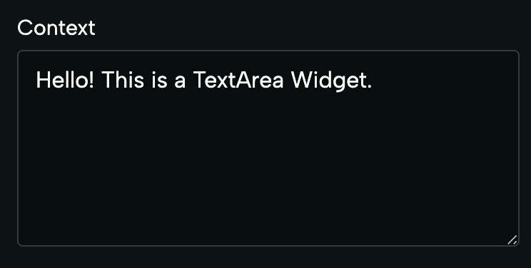
This widget is rendered for text fields using the
JSDoc Annotation with the special formatting
@format textarea. Example:
export interface Props {
  /**
   * @format textarea
   */
  context: string;
}
CheckBox

This widget is rendered for boolean fields. Example:
export interface Props {
  showTopbar: boolean;
}
ImageUri
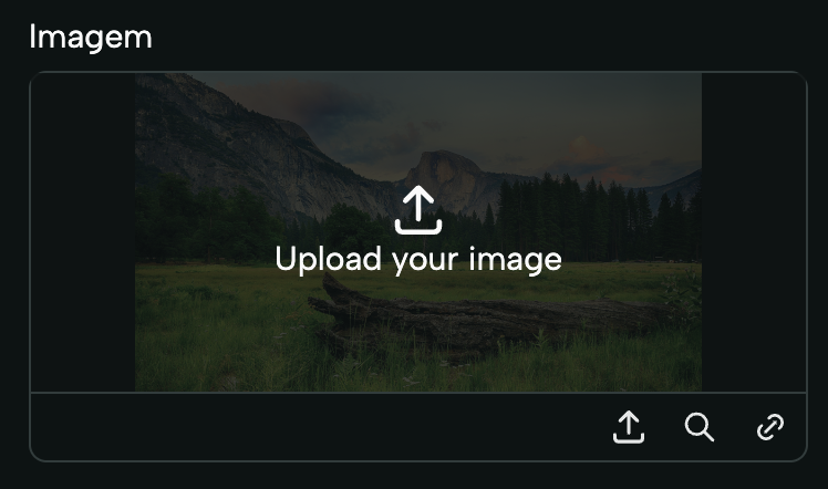
This widget is rendered for fields of type ImageWidget. This type can be
imported from deco-cx/apps. Example:
import { ImageWidget as Image } from "apps/admin/widgets.ts";

export interface Props {
  image: Image;
}
VideoUri
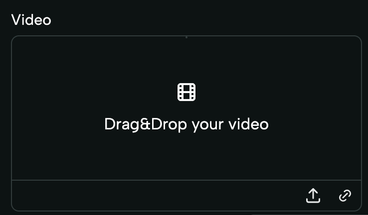
This widget is rendered for fields of type VideoWidget. This type can be
imported from deco-cx/apps. Example:
import { VideoWidget as Video } from "apps/admin/widgets.ts";

export interface Props {
  video: Video;
}
Section
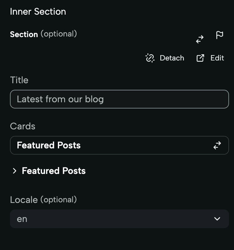
The Section widget is used to create Sections that can receive other Sections
as properties. It works similarly to receiving other components via props. When
using this field, you can select any Section from your project. The form
rendered in this widget takes the form of the same form that would be rendered
for the selected Section. This widget is rendered for fields of type Section.
This type can be imported from deco-cx/apps. Example:
import { Section } from "deco/blocks/section.ts";

export interface Props {
  innerSection: Section;
}
Select
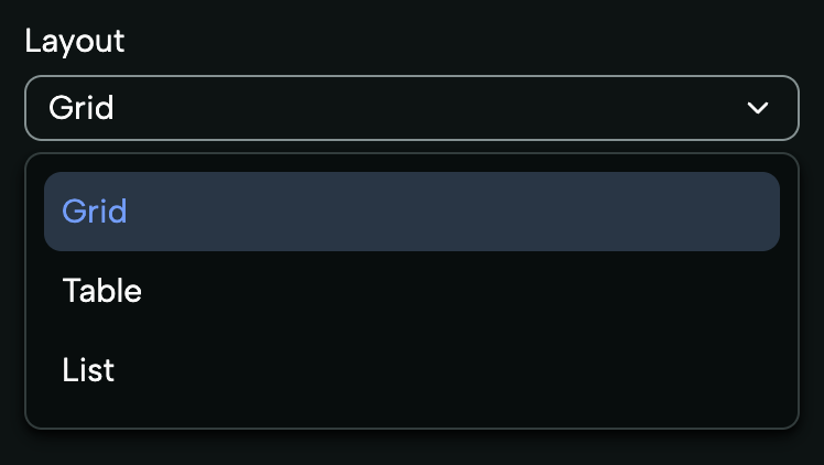
The Select widget is used to create dropdown lists or option menus, allowing users to choose between different alternatives. This widget is rendered for fields whose type is a Union in Typescript. Example:
export interface Props {
  layout: "Grid" | "Table" | "List";
}
HTML
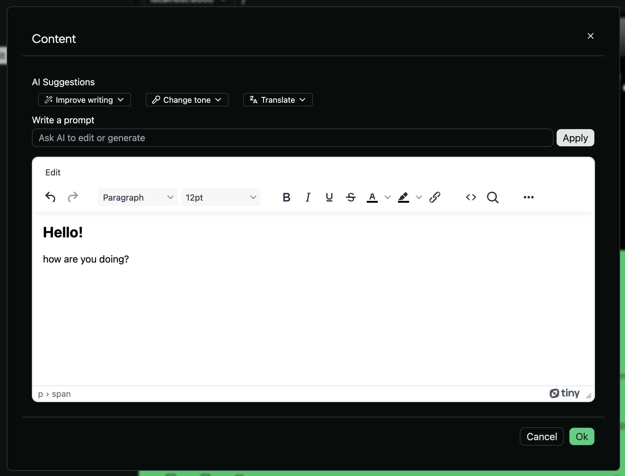
The HTML widget is rendered for fields of type HTMLWidget. This widget allows
editing the content of its field through a
WYSIWYG (What You See Is What You Get)
Editor. This type can be imported from deco-cx/apps. Example:
import { HTMLWidget as HTML } from "apps/admin/widgets.ts";

export interface Props {
  content: HTML;
}
Secret
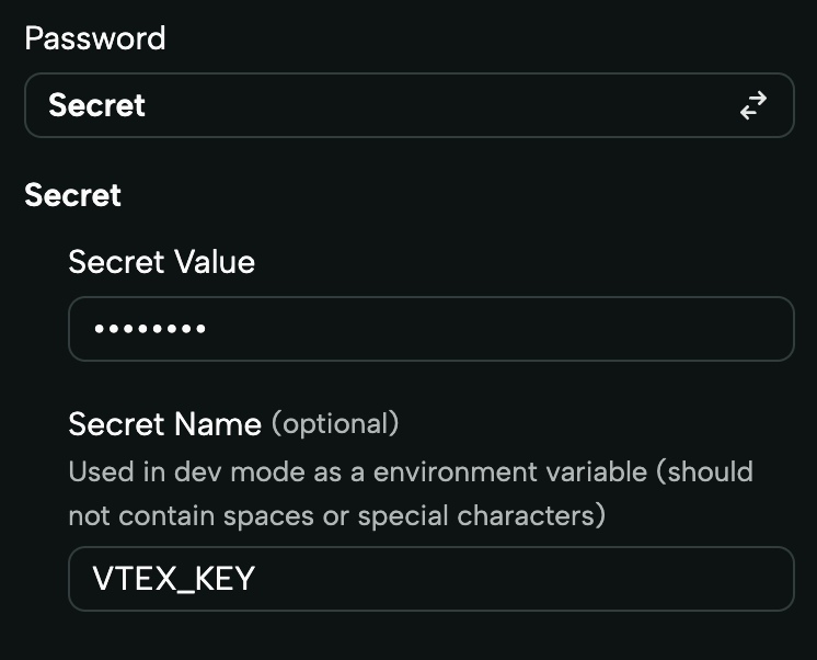
The Secret widget is intended for sensitive fields, such as passwords, and
ensures that the content is encrypted to protect confidential information. It is
rendered for fields of type Secret. This type can be imported from
deco-cx/apps. Example:
import { Secret } from "apps/website/loaders/secret.ts";

export interface Props {
  password: Secret;
}
Dynamic Options
This widget is especially useful when the options available in a field depend on dynamic data. It displays the same as the Select, but its options can be loaded dynamically via a loader!
Example:
MySection.tsx
export interface Props {
  /**
   * @format dynamic-options
   * @options deco-sites/mystore/loaders/products.ts
   */
  product: string;
}
mystore/loaders/produtos.ts
import { allowCorsFor, FnContext } from "deco/mod.ts";

export default function ProductsLoader(
  _props: unknown,
  req: Request,
  ctx: FnContext,
) {
  // Allow Cors
  Object.entries(allowCorsFor(req)).map(([name, value]) => {
    ctx.response.headers.set(name, value);
  });

  return ["Product X", "Product Y", "Product Z"];
}
Color Input
The Color Input widget displays a filled circle representing the selected color along with its corresponding hexadecimal value. Users can interact with the widget by clicking on it to open a color picker.
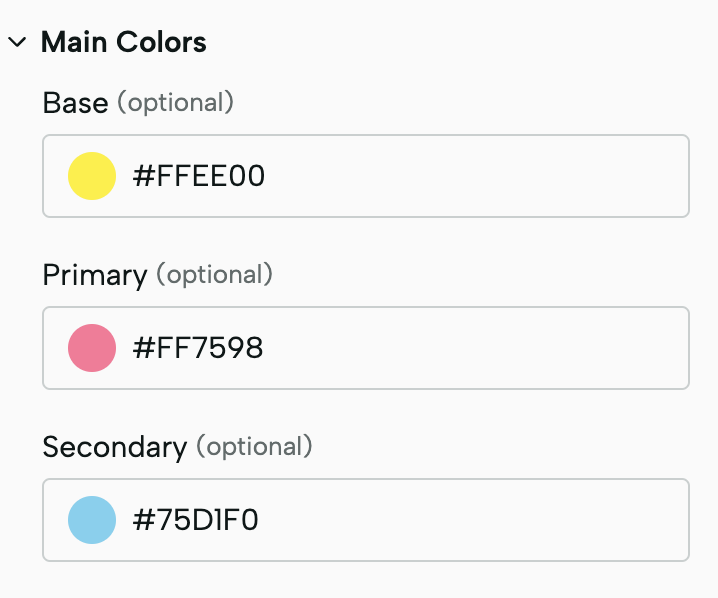
Example:
MySection.tsx
export interface Props {
/** @format color-input */
"primary"?: string;
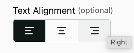
}Button Group
The Button Group widget allows you to render select options in an icon format, providing a visually appealing way to choose options. Each option is represented by an icon, offering flexibility and customization for your application.
Example:
MySection.tsx
export interface Props {
  /**
   * @format button-group
   * @options deco-sites/mystore/loaders/icons.ts
   */
  textAlignment?: "Left" | "Center" | "Right";
}
To ensure that icons are available for selection in the widget, it's essential
that each icon is explicitly defined as an SVG string in static/adminIcons.ts
file and exported as a constant:
mystore/static/adminIcons.ts
// adminIcons.ts contains all available icons needed for rendering the widget, in a string format.
export const AlignLeft =
  `<svg id="AlignLeft" width="20" height="20" viewBox="0 0 20 20" fill="currentColor">
<path ... />
</svg>`;
mystore/loaders/icons.ts
import { allowCorsFor, FnContext } from "deco/mod.ts";
// Import icons in string format
import { AlignCenter, AlignLeft, AlignRight } from "../static/adminIcons.ts";

// Define icons with their labels and corresponding props as defined on your Props interface
const icons = [
  { component: AlignLeft, label: "Left", prop: "textAlignment" },
  { component: AlignCenter, label: "Center", prop: "textAlignment" },
  { component: AlignRight, label: "Right", prop: "textAlignment" },
];

// Loader function to map icons to the format expected by the Button Group widget
export default function IconsLoader(
  _props: unknown,
  req: Request,
  ctx: FnContext,
) {
  Object.entries(allowCorsFor(req)).map(([name, value]) => {
    ctx.response.headers.set(name, value);
  });

  const iconsMap = icons.map((icon) => ({
    value: icon.component,
    label: icon.label,
    prop: icon.prop,
  }));

  return iconsMap;
}
Icon Select
The Icon Select widget enables you to create a select input for icons, where each option consists of both an icon and its label. This allows users to preview and choose the right icon easily. All icons rendered in the widget must be defined explicitly as SVG strings.
Example:
MySection.tsx
export interface Props {
  /**
   * @format icon-select
   * @options deco-sites/storefront/loaders/availableIcons.ts
   */
  icon: AvailableIcons;
}
To ensure all icons are properly integrated and selectable within our widget,
each icon from your static/sprites.svg file must be explicitly defined as an
SVG string and exported from a separate file, static/adminIcons.ts. We have
streamlined this process with the generate-icons.ts script on Deco's
storefront template, which automates the conversion of icons from sprites.svg
into string format and writes them on adminIcons.ts.
To add new icons, simply insert them into your sprites.svg. Then, stop the
project's execution and restart it using deno task run. This triggers the
generate-icons.ts script, updating the adminIcons.ts file with the new
icons, making them immediately available for selection in the widget. This
approach centralizes icon updates to sprites.svg, ensuring a smooth update
process.
Be aware that if an icon is not exported as a string on static/adminIcons.ts, it will not be displayed as an option in the selector.
mystore/loaders/availableIcons.ts
import { allowCorsFor, FnContext } from "deco/mod.ts";
import { AvailableIcons } from "../static/adminIcons.ts";

const icons = Object.keys(AvailableIcons).map((iconName) => ({
  component: AvailableIcons[iconName as keyof typeof AvailableIcons],
  label: iconName,
}));

// Used to load all available icons that will be used for IconSelect widgets.
export default function IconsLoader(
  _props: unknown,
  req: Request,
  ctx: FnContext,
) {
  // Allow Cors
  Object.entries(allowCorsFor(req)).map(([name, value]) => {
    ctx.response.headers.set(name, value);
  });

  // Mapping icons to { value, label, icon }
  const iconsMap = icons.map((icon) => ({
    icon: icon.component,
    label: icon.label,
    value: icon.label,
  }));

  return iconsMap;
}