Summary
Deco provides Image, Picture, and Source components to work with images. These components add responsive patterns to speed up your site. To add an image to your site:
- Add the deco image components (
<Image/>,<Source>,<Picture>) to your code- Style the components with CSS until you achieve the desired appearance
- Set the width and height attributes of the component.
The deco components already provide:
- Responsive images for all screen sizes
- Preloading tags to improve LCP
- Image processing to optimize image size
Image or Picture
There are two components for displaying images: <Image> and <Picture>. The
appropriate component depends on your use case:
<Image>displays an image (internally using<img>) and is useful for images that always have the same aspect ratio (width vs height) regardless of screen size.
<Picture>defines images that can vary in size according to the screen resolution.

Adding an image
Using the appropriate component, style it with Tailwind classes. It is mandatory to set the src and use the height/width props:
import Image from "apps/website/components/Image.tsx";

export default function MeuComponente() {
  return (
    <Image
      src="https://example.com/image.png"
      class="w-full h-full object-cover"
      width={800}
      height={1200}
    />
  );
}
The width/height does not change the size of the image on the screen as it is styled by CSS. These attributes don't even need to be the original size of the image. The height and width are present to allow the server and browser to choose the appropriate image to download based on the user's screen resolution.
Adding a Picture
Below, you will find a minimal example that renders an image for desktop and another one for mobile devices.
import { Picture, Source } from "apps/website/components/Picture.tsx";

function MeuComponente() {
  return (
    <Picture>
      <Source
        media="(max-width: 768px)"
        src="https://example.com/image-mobile.png"
        width={270}
        height={377}
      />
      <Source
        media="(min-width: 768px)"
        src="https://example.com/image-desktop.png"
        width={800}
        height={1200}
      />
      <img
        src="https://example.com/image-desktop.png"
        class="w-full h-full object-cover"
      />
    </Picture>
  );
}
Note that you should use the
<img>tag inside Picture, not the<Image>component. Also note that thesrcattribute in the<img>tag is REQUIRED and should receive the larger image, in this case, the desktop image.
The example above renders the /image-mobile.png image for screen sizes up to
768px wide. For larger screen sizes, the /image-desktop.png image will be
rendered.
To style this image, add classes to the <img> tag. For example, to make the
image fill the available space, as shown in the example above.
Finding the width and height properties
The width and height attributes of the image can be confusing, even for
experienced developers. This confusion arises from the fact that these
attributes DO NOT change the final size of the rendered image on the screen.
Instead, they affect the image that the browser will download in a responsive
image scenario. Choosing appropriate width and height values is key to
downloading a small image for good LCP results.
To find a good width and height value:
- Open your website and inspect the image element.
- Set the viewport to the desired size (412px for mobile devices or 1440px for desktop).
- Hover over the image tag. You should see something like:
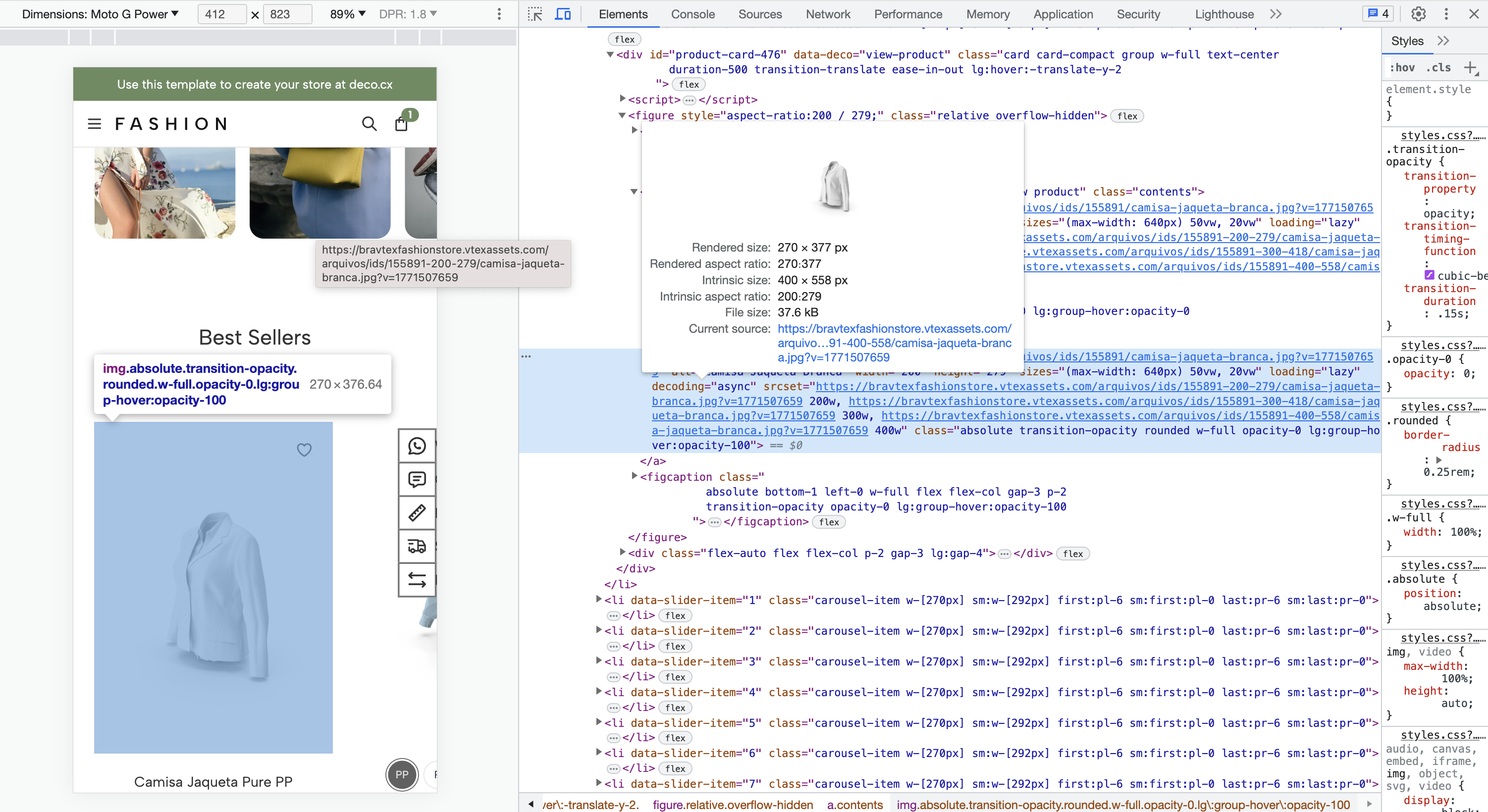
- Voilà! A good width and height value is available in the "Rendered size"
attribute. In this case, the
widthis 270px and theheightis 377px.
Loading images in an optimized way (improving LCP)
For a good LCP, not only do you need to send small payloads, but you also need to load them in the correct order, prioritizing those that are visible on the screen over other elements (below the fold). A good heuristic is:
- Prioritize the LCP image.
- Lazy load all other images.
Fortunately, the <Image> and <Picture> components from Deco help us achieve
this behavior. Start by identifying the largest element on the screen (LCP).
Then, open the component's code and check if:
- The
preloadattribute is set. - The
loadingattribute is set to 'eager'. - The
fetchPriorityattribute is set to 'high'.
For example, for an <Image/> component:
import Image from "apps/website/components/Image.tsx";

export default function MyComponent() {
  return (
    <Image
      src="https://example.com/image.png"
      width={270}
      height={377}
      preload
      loading="eager"
      fetchPriority="high"
    />
  );
}
For a <Picture/>:
import { Picture, Source } from "apps/website/components/Picture.tsx";

function MyComponent() {
  return (
    <Picture preload>
      <Source
        media="(max-width: 768px)"
        src="https://example.com/image-mobile.png"
        width={270}
        height={377}
      />
      <Source
        media="(min-width: 768px)"
        src="https://example.com/image-desktop.png"
        width={800}
        height={1200}
      />
      <img
        loading="eager"
        fetchPriority="high"
        src="https://example.com/image-desktop.png"
        class="w-full h-full object-cover"
      />
    </Picture>
  );
}
Make sure that other images do not have the preload attribute and have the
loading="lazy" and fetchPriority="low" attributes. By adding these
configurations, you will optimize the image loading to improve LCP.
Tip: The final page should have only one preloaded image. Preloading multiple images worsens the LCP score. To verify that only one image is being preloaded, check that there is only one
<link rel="preload"/>tag.