Suggested Reading
You already know that it's easy to create a configurable
Section on deco.cx. In this post we'll outline
all the possible ways that you can declare the props types and how that
impacts the form we render on deco.cx's Admin.
Customizing sections
Sections, as regular Preact components, accepts props
as their first argument and use those values in their markup to display texts,
images or configure some behavior.
Usually, these props are passed in another component, but when you're using
deco.cx these props are configured in the Admin, which makes it easy for
business users to change content in their Sites.
To declare how these props will be configured you can use the Typescript
type, specifying which props and their respective type like string,
number, Array<T>, etc..
Example:
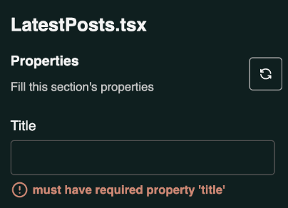
- Section configuration in a deco.cx's Site.
interface Props {
  title: string;
}

export default function LatestPosts({ title }: Props) {
  return (
    <div>
      <h1 class="font-bold">{title}</h1>
      <p>This is an example section</p>
    </div>
  );
}- Preview of section editing in Admin
Types accepted
The deco.cx editor accepts a subset of types Typescript for section configuration. This is the list of supported types in time:
Native Types
string
export interface Props {
  title: string;
}
number
export interface Props {
  numberOfLines: number;
}
object literal
export interface Props {
  address: {
    street: string;
    postalCode: string;
  };
}
array
export interface Props {
  menuItems: Array<{ label: string; value: string }>;
}
string options
export interface props {
  variant: "primary" | "secondary" | "tertiary";
}
Special Types
Image
This type renders an image upload widget in the editor, making it possible for users to upload images from their own computer.
The type is a wrapper for string, so the Section will get the URL of the
image that will be hosted on deco.cx servers.
You can read more about how to work with Images in deco.cx here
Optional: deco.cx provides a component that optimizes the image loading and can be used in conjunction with this property. Example:
import type { ImageWidget as Image } from "apps/admin/widgets.ts";

export interface props {
  bannerImg: Image;
}
Video
Similar to Image, properties with this type will be edited through a video upload widget.
Example of use here.
import type { VideoWidget as Video } from "apps/admin/widgets.ts";

export interface props {
  myVideo: Video;
}
Enriching the editor
When using native types, the editor will use the prop's name as the input Label by default. But it's possible to customize this using JSDoc tags.
- Example: Section code:
export interface props {
  /** @title Numero de produtos */
  /** @description Total de produtos para mostrar na vitrine */
  count: number;
}- Editor:
The available tags are fields compatible with
JSON Schema, i.e. @title, @description,
@format among others. For example, to accept emails only:
export interface props {
  /** @format email */
  color: string;
}
Other types of valid formats are: uri, color.
Loading data from external APIs
A common use-case for getting data inside of Sections is to use external sources like APIs or databases. This is a very common scenario in ecommerce stores, where we usually want to get product data from an ecommerce provider's API (like Shopify, Magento, VTEX...).
To understand how to accomplish that with Sections and Loaders, go to the Fetching data from APIs tutorial.